Welcome to my experience design portfolio. I have been incredibly fortunate to work with a variety of clients in my career. My practice in user experience is just a little over 21 years. In that time frame I have seen technology evolve in a variety of industries, and I have made sure to be at the forefront of this change.
My methods involve empathy and strategy of understanding the users. Observing what the users do, focusing efforts on research, analysis, design, production, product launch, and evaluation. I ask questions, but most importantly I listen. This is my roadmap for success. Real science compliments the beautiful visuals to complete form and function. I want to make sure I have learned something while delivering great user experiences and value to products.
All logos and products belong to their respective companies. User experience, research, and designs created by Erick Moya.
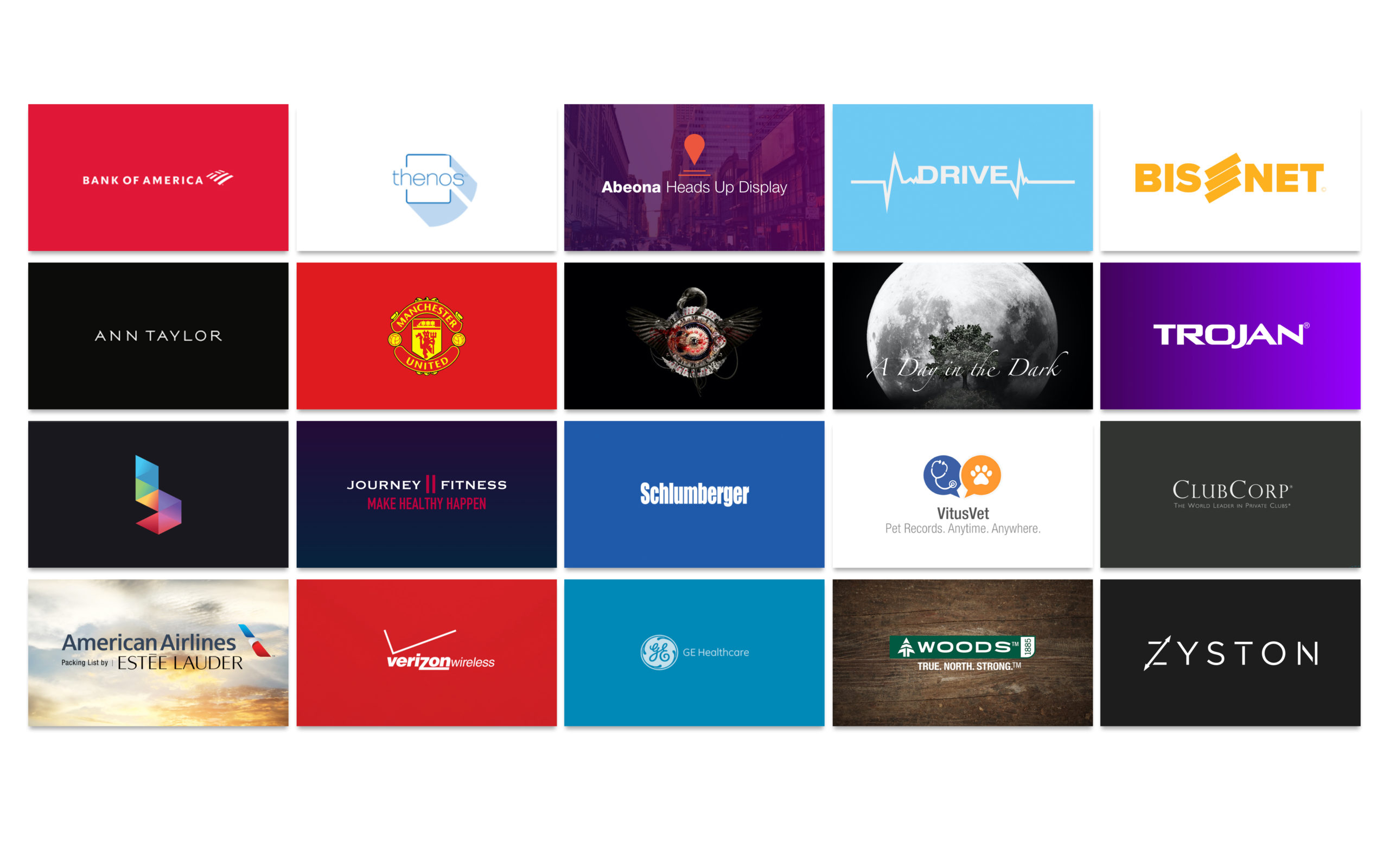
Featured Clients
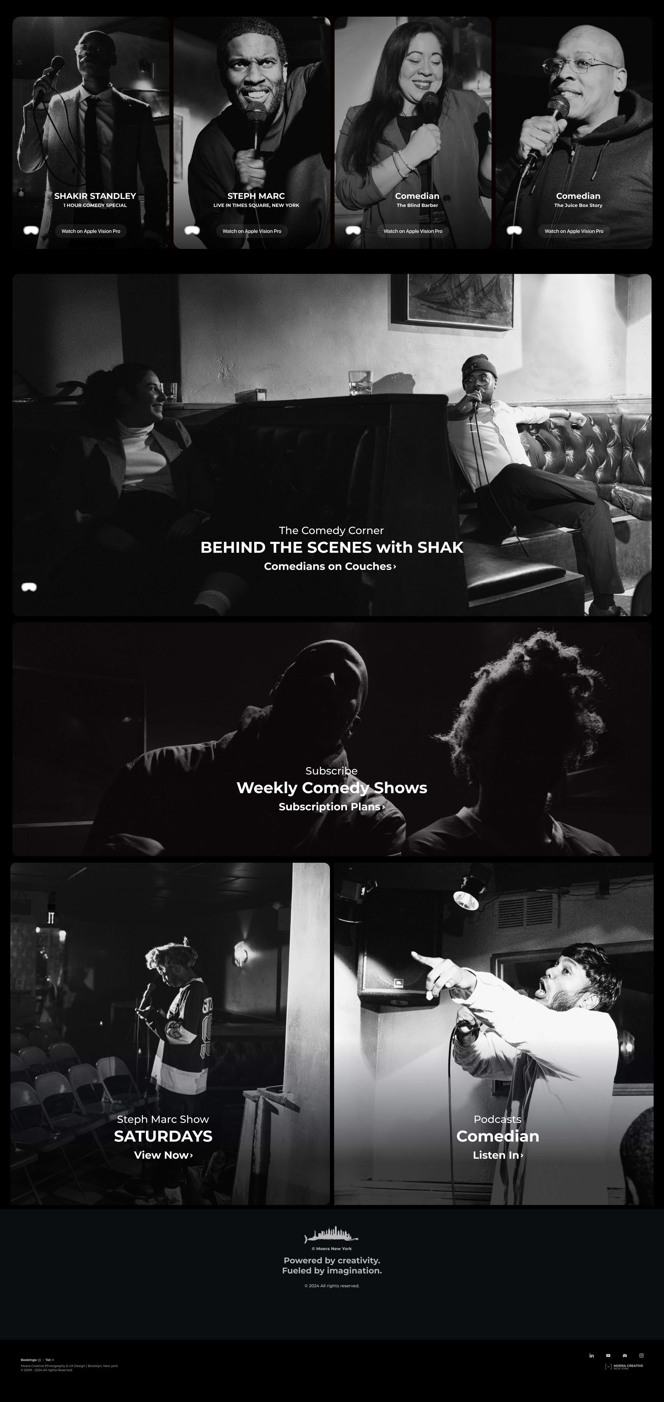
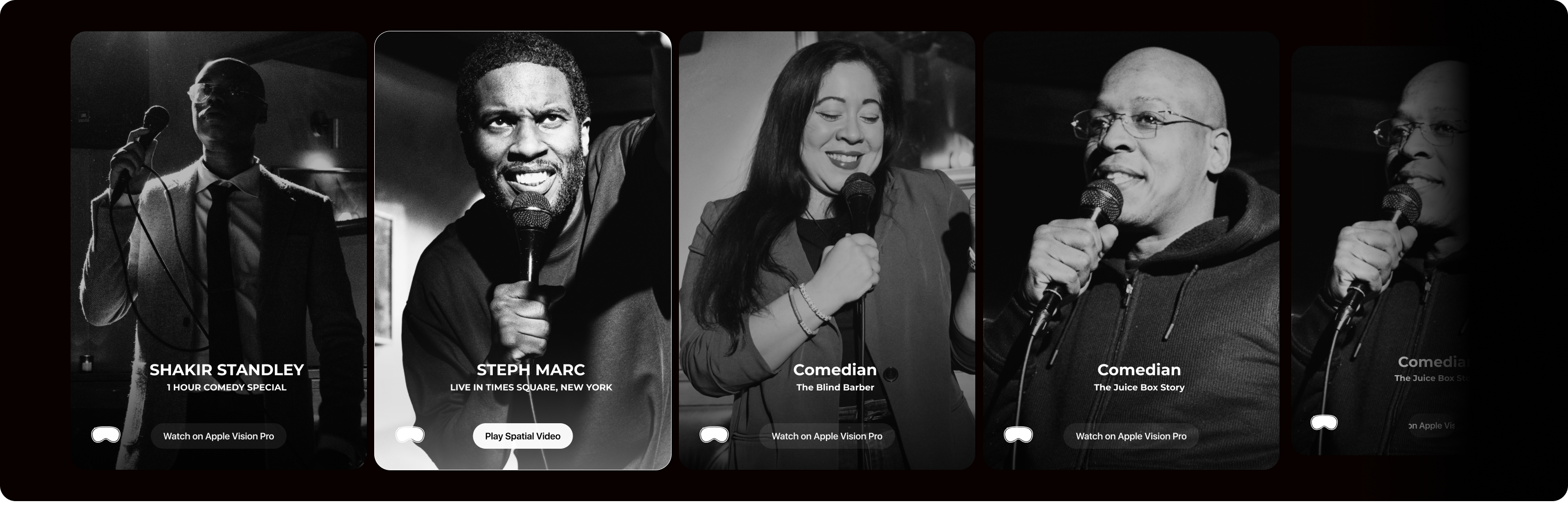
Apple Vision Pro: Spatial Video Platform
Objective:
Apple Vision Pro is in its first iteration, and there is a small amount of entertainment and educational content. I wanted to create a spatial video platform for performers like comedians and music instructors.
Outcome:
Currently in the prototyping stage and collaborating with street performers, stand up comics, and music instructors to progress on the concept.
My Role:
I am creating a concept based off of research in speaking with the Apple Vision Pro owners community, music instructors, comedians, and users of a wide age range. My research is based on interest to consume entertainment, take lessons, and multi task while listening to live comedy. Engaging with the AVP audience to drive interest in a paid subscription platform for these types of genres.
Services:
UX Research & Discovery | UX Design | Design Language | UX Production
Tools: Photography, Adobe Photoshop, Figma, Apple Vision Pro, VisionOS
Current Iteration: Version 1
Apple Vision Pro: Spatial Art Gallery
Objective:
To create a new way to experience art, art galleries, and learn about artists past and present.
Outcome:
This is a brainstorm work in progress design with a very basic prototype to begin the first iteration of the Apple Vision Pro experience to generate interest.
My Role:
I am creating experiences for artists who wish to present their art work in a whole new light. By researching how artists and art galleries do business with collectors, fans, and prepare for in house experiences, I have learned how to create an immersion for those in the virtual space.
Services:
UX Research & Discovery | UX Design | Prototyping
Tools: Photography, Adobe Photoshop, Figma, Apple Vision Pro, VisionOS
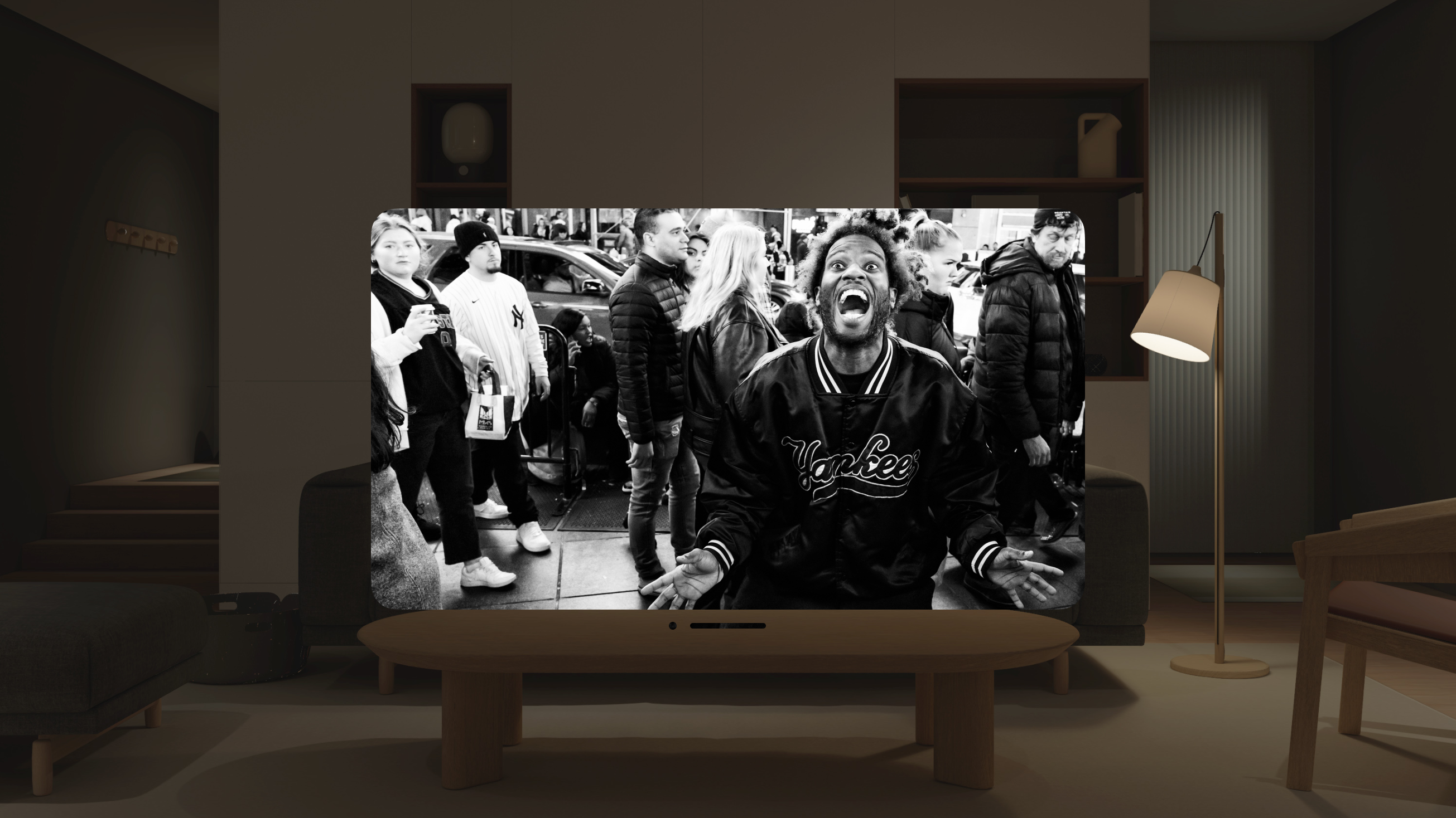
Bank of America: Erica A.I. Virtual Assistant & Mobile Banking
Objective:
Bank of America is one of the largest multinational investment banks in the world. The company wanted to bring forth more depth and dimensionality to their AI banking app (Erica) to distinguish the ui for tapability, a more interactive appearance to the virtual assistant, and an updated interface to appeal to a wider audience of mobile banking users. Erica is the first virtual assistant for your mobile banking needs.
Outcome:
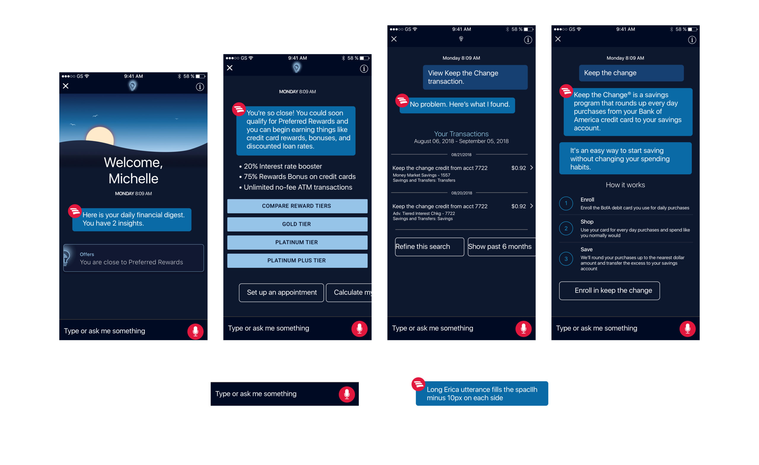
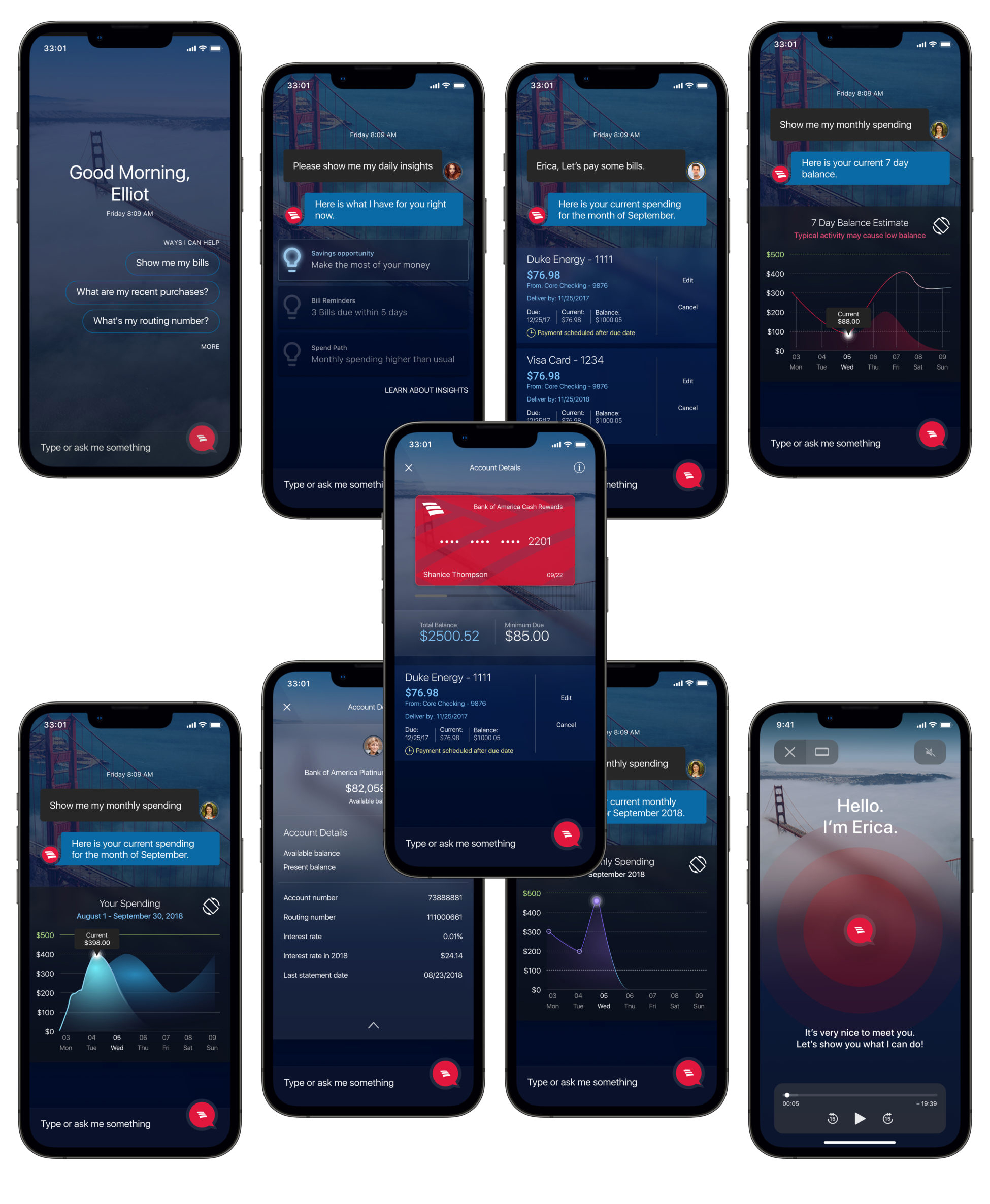
In creating a new 2.0 initiative, I set out to implement more of that depth and dimensionality for the new iteration. Erica is loaded with richer user interface visualizations. Data being one of the most important visual elements to the experience. I began with giving Erica a new visual personality.
It was important to present a branding and cutting edge appeal for the existing library. In this iteration I also wanted to introduce location based visuals, recognizable iconography, distinguished messaging interaction with avatars, a way to see the full visualization of data charts, bank card visualization, and a clearer way to view the data.
My Role:
I was tasked in finding a solution to giving the Erica AI an identity as recognizable as Apple’s Siri while updating a version 2.0 design language with more depth and dimensionality. While working with the leadership team I had to understand what the design direction was, what elements worked and did not work, how to make the design less jarring, and implementing modern design trends within a small space. We had 45 days to make the presentation.
Services:
UX Research & Discovery | UX Design | Design Language | Logo Redesign | UX Production
User feedback and observation showed that important information and tappable elements within the design system were blending in. This made it difficult for users to intuitively figure out what was tappable. The microphone icon represented Erica, and users had to tap on the microphone to activate the virtual assistant functions. The Bank of America logo was a part of the message utterances which felt a little obtrusive. There was no personalization from the user’s perspective.
The Interface Enhancements:
Updates to the design system included a new Erica AI design identity. I changed the microphone icon, placed the Bank of America logo within a speech bubble container to activate that interaction. Next, I designed a new message utterance and placed the Bank of America avatar off to the side instead. Every user is somewhere, so I integrated the major city landmarks into the backgrounds which faded out once the interactions took place. Other changes included much improved iconography, spending graphs, cards on account, bill pay, micro interactions, and quick actions.
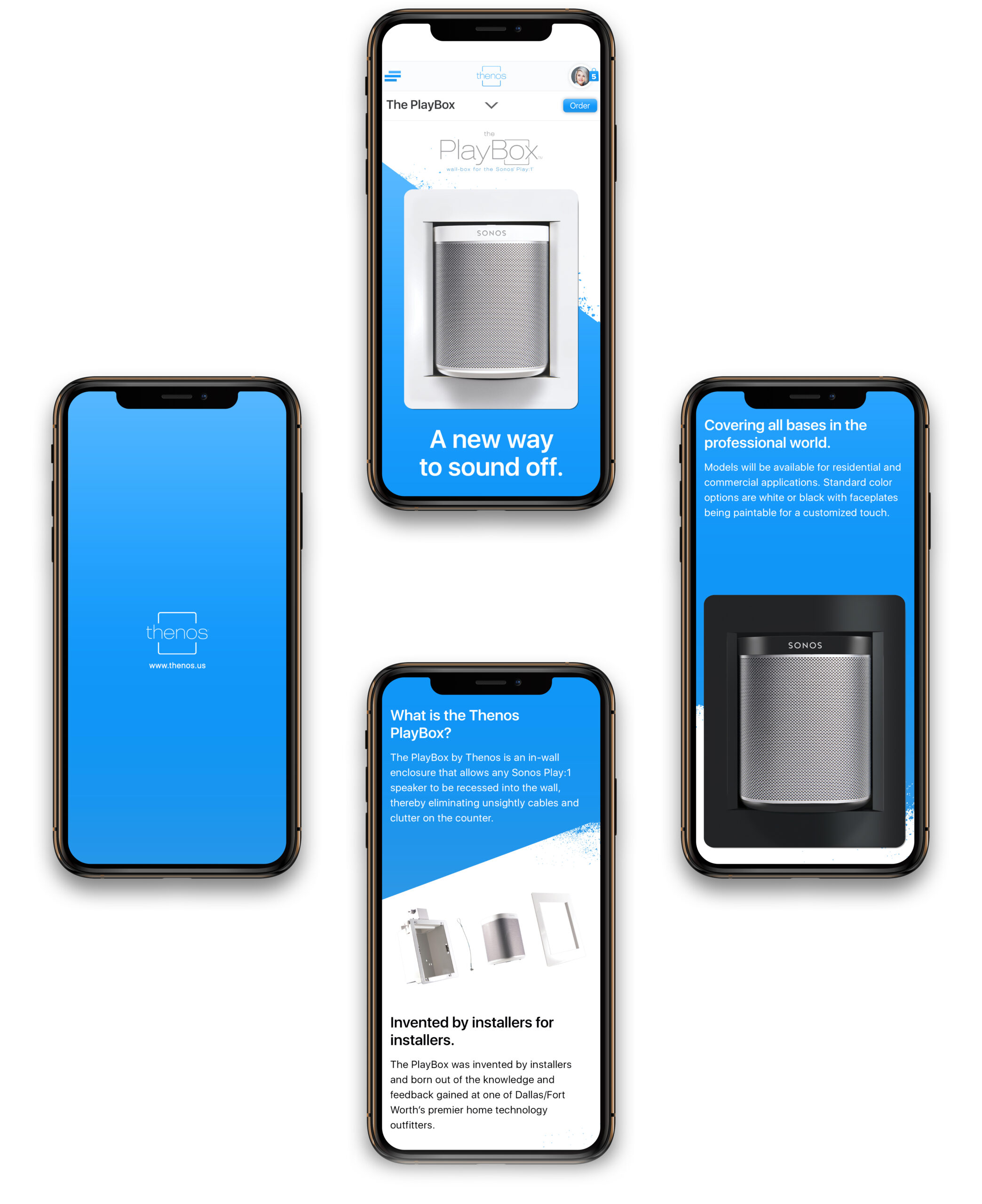
Thenos of Honest Install
Objective:
Honest Install is an audio visual company I had the pleasure of designing for during their CEDIA EXPO conference. A part of their product line up has been AV fixtures for the Sonos product line by Thenos. Thenos is innovative in creating hidden speaker mounting fixtures in smart homes, and they needed a way for their customers to purchase their new PlayBox during CEDIA EXPO.
Thenos wanted a website that would be a companion piece to the booth showcase. This informative and easy to use website allowed for the customer to learn about the PlayBox, understand the installation process, ask questions, and ultimately make a purchase.
Outcome:
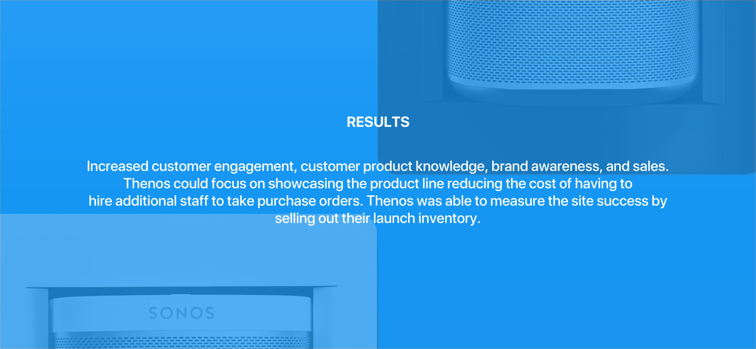
Understanding the demographics of CEDIA EXPO, smart home technology, and Thenos as a brand was an important part of the research. I interviewed the key members of staff to better understand the industry, the technology, major brands, and UX maturity within the company. I conducted competitor analysis on a local and global level. I wanted to see how strong the competition was with their branding, marketing, and products. I also wanted to understand the type of people who would be at CEDIA EXPO.
I wanted the user experience to make an impact for these tech savvy demographics. The Thenos booth was also focused on demonstrating their products during CEDIA EXPO, and it was important to maximize their orders to measure their product launch success. Thenos wanted a strong brand representation to reflect in the mobile site experience that attendees could easily connect to, learn more about their product, and have appealing visuals of the variances for the PlayBox which would ultimately lead to purchase orders.
Services:
UX Research & Discovery | UX Design | User Stories | Brand Study | Photography
Tools: Sketch, Adobe Photoshop, Invision, Digital Camera & Lighting
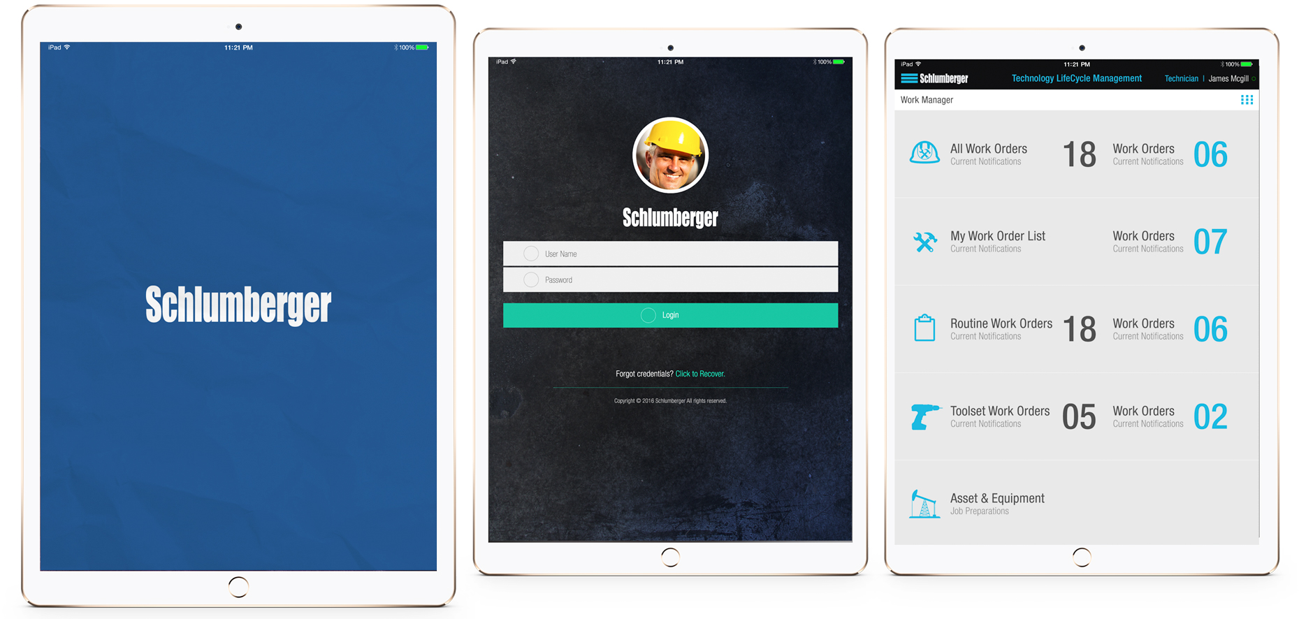
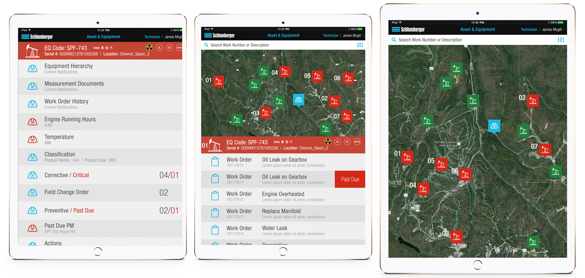
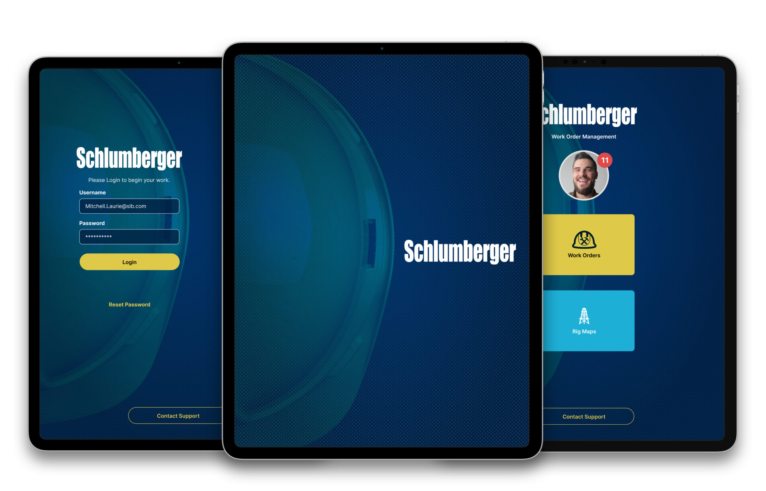
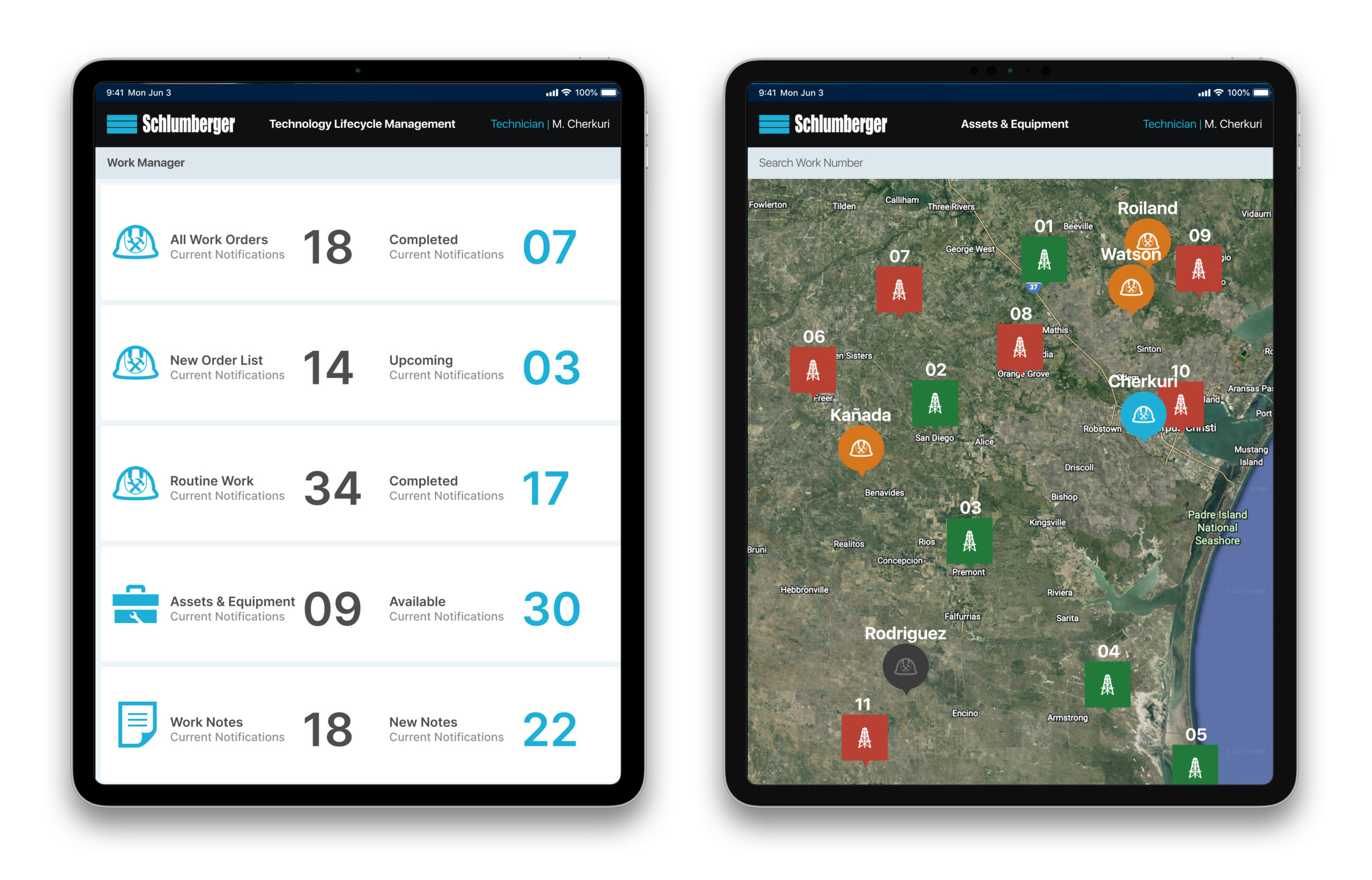
Schlumberger Work Order & Logistics
Objective:
To create a mobile experience for Schlumberger field techs who need to view, document, record progress, and update work orders while overcoming the technology knowledge challenges, logistics, bright days, and cumbersome work gloves which can hinder the human to computer interaction.
Outcome:
A leader in the oil and gas industry, Schlumberger’s field tech app allows repair techs to organize their tools, record their work order progress, and see a map which categorized their repair locations in order of priority. These techs could gather all the tools using the checklist within the app, and they would be in direct contact with their home base which could monitor their progress.
My Role:
I had 48 hours to solve a proof of concept design and create a full presentation for Schlumberger leadership. My task was to take the very little amount of information I had and design a solution for the common challenges faced among the SLB technicians out in the field. I had to put myself in the SLB technician’s position, understand their challenges, take note of the weather conditions, figure out communication and logistics issues, and solve for the business needs.
Making the not so connected worker with technology become comfortable and balanced with using these devices in their work flow. Once I had a good understanding of this, my thought was to create the scenarios where the mobile device would fit before, during, and after the service call. I made sure to wireframe a workflow that made sense. Upon finding what I thought was a good solution, I created a proof of concept with SLB branding to make a recognizable presentation that integrated into the Schlumberger eco system.
Services:
UX Research & Discovery | User Stories | UX Design | Brand Study | Photography
Tools: Figma, Sketch, Adobe Photoshop, Invision
The Interface Challenge:
First pass of the user experience I wanted to present the information in a clear and understood layout. Perhaps at this stage a technician still had their work gloves on, maybe the typography wasn’t big enough, or the clarity wasn’t entirely there in terms of iconography. Urgency and hierarchy for service orders had to be factored in.
UX Enhancements:
Starting the experience off with the addition of Face ID and large buttons to begin the technician workday set the tone for the experience. Everything was larger within the interface to make it easier to read, navigate, and tap.
Results:
The presentation of the proof of concept not only allowed the company I represented to get the foot in the door, but the strength of the application, the story, and the amount of time I had to create won us a multi million dollar contract. This opportunity gave the company I represented the foothold to develop a suite of applications for Schlumberger, create jobs, build teams, and further their reach within the oil and gas industry.
Abeona Heads Up Display
Objective:
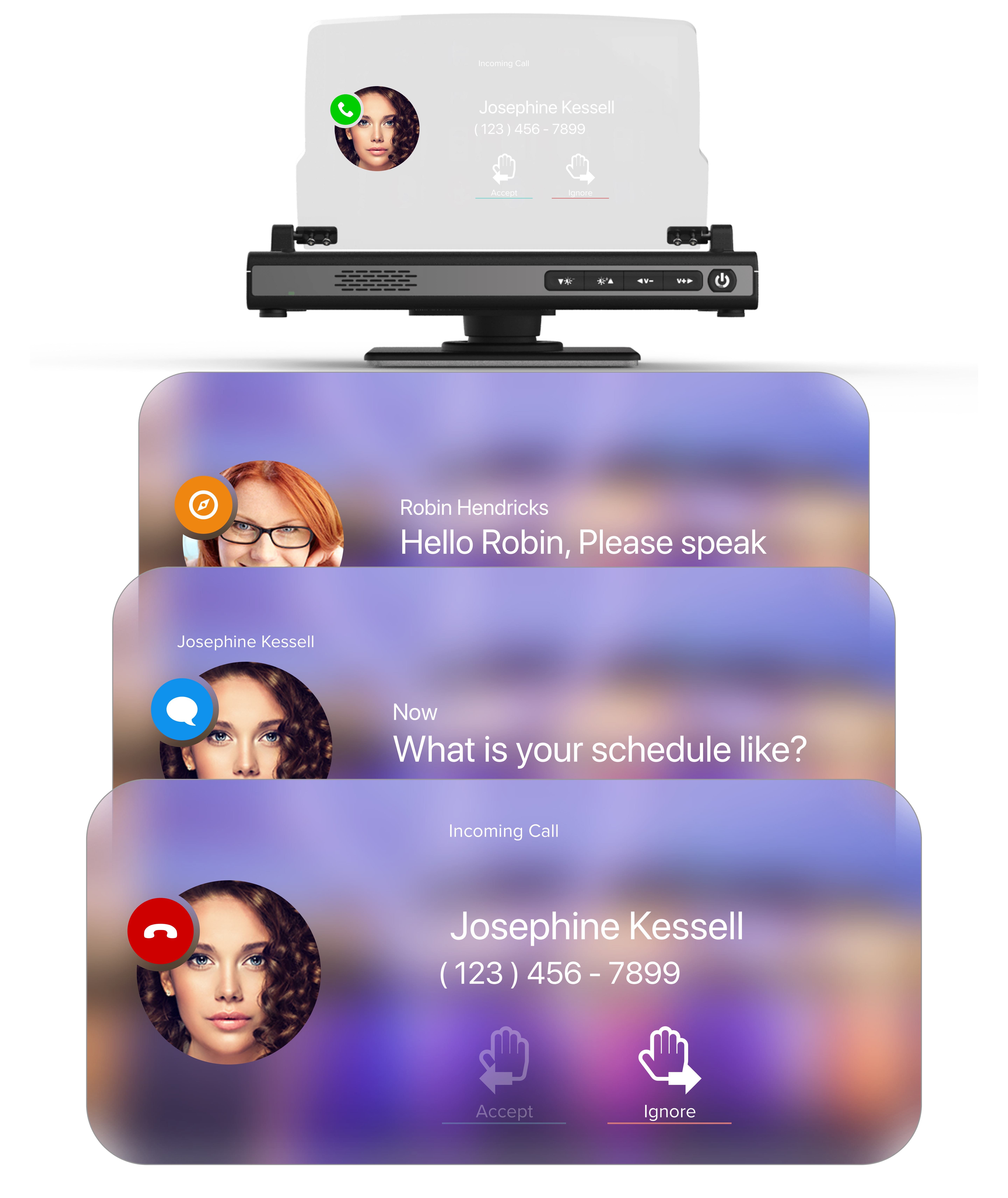
With the auto industry now paying attention to UX, there have been some accessories to which you can enhance your driving experience. Abeona worked with motion and voice controls that integrated with your vehicle and mobile device. Abeona is an intelligent system which will control some of your vehicle functions such as answering phone calls, routing directions, playing music, points of interests, and vehicle alerts. A simple interface needed to be displayed which was unobtrusive but easily fitting within the experience of the rest of the vehicle. It had to handle simple tasks with hand motions and voice commands.
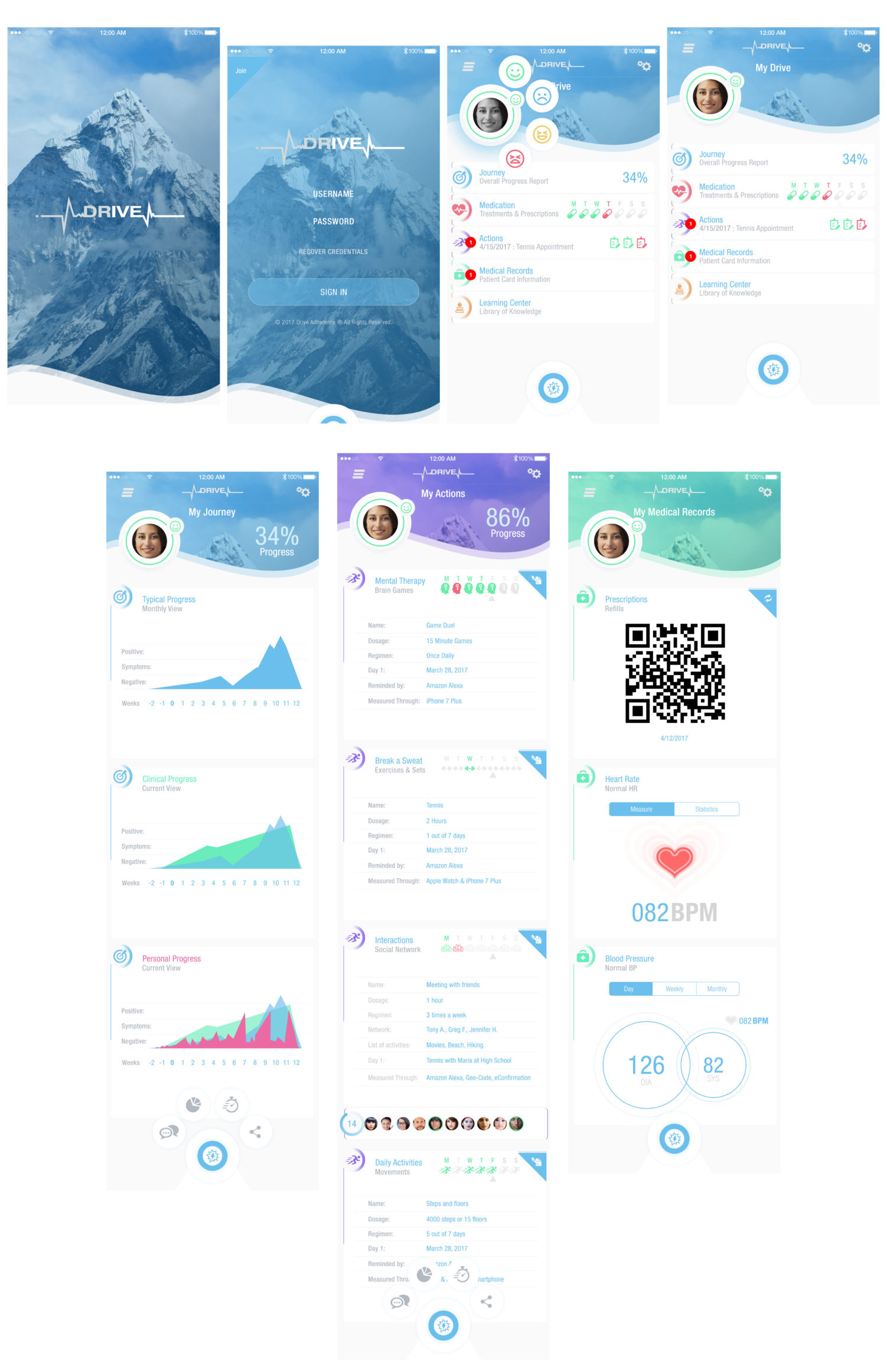
Drive was a proof of concept for the life science industry. Bringing together the patient, physician, and the Pharma company to build a better relationship between these worlds for adherence and better patient health care.
Outcome:
To solve these real world problems we created the Drive App in order to unify and drive that adherence within the Pharma, physician and patient relationship. Drive is an application that allows the user to better adhere to their physicians instructions, improving their health and quality of life, keeping track of medications and activity tracking, as well as building that foundation between doctor and patient.
Services:
UX Research & Discovery | Interviews | UX Design | Logo Design | Branding | Palette
Tools: Sketch, Adobe Photoshop, Invision
The Story:
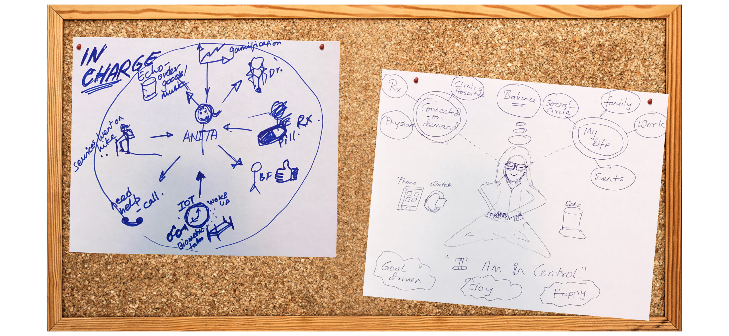
How to take advantage of the mobile space to benefit the patient while connecting them with their physician for preventative health care. I asked a lot of questions which wrapped around understanding these user perspectives. Why was there a disconnect? What were those specific challenges for each perspective. What was the patient experience like? I wanted to better understand the story behind the patient, what happens when they leave the doctor’s office, how the doctor and patient follow up with one another, and where does the pharmaceutical company fit in?
The Journey:
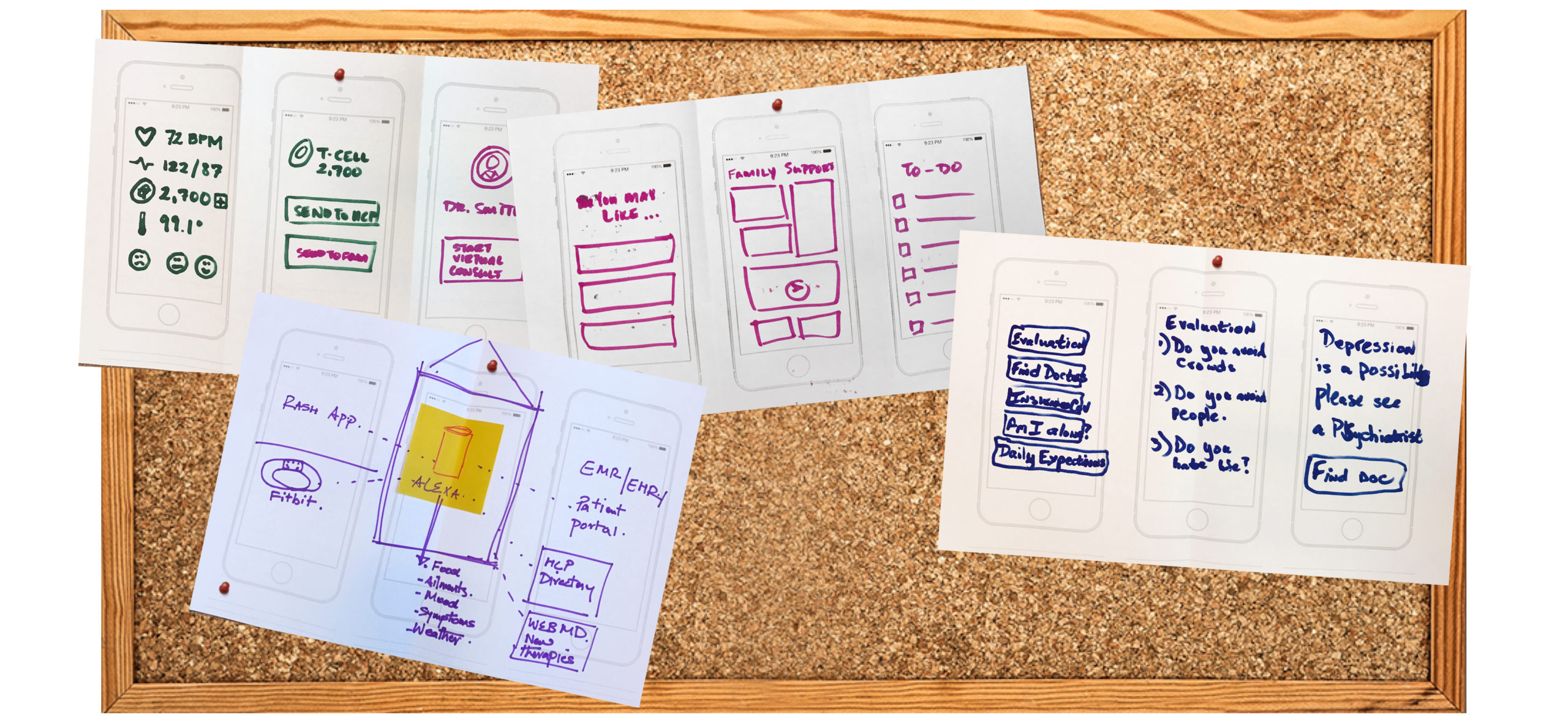
The discovery process led to seeing what was currently out in the market to solve these problems users faced. Clunky systems for both patient and physician existed to no end. Patients were often asked to register through a web portal where they could see their office visits, some instructions, fill out additional forms, but nothing to really drive that adherence.
The experience was much like giving the patient more homework to do which really did not bring that connection, nor did it drive the adherence needed. So I broke it down to the fundamental elements of what was important for the patient to know about their health, and what were the common drivers between patient and doctor.
The Result:
Drive, the patient and doctor mobile phone application for better health and adherence.
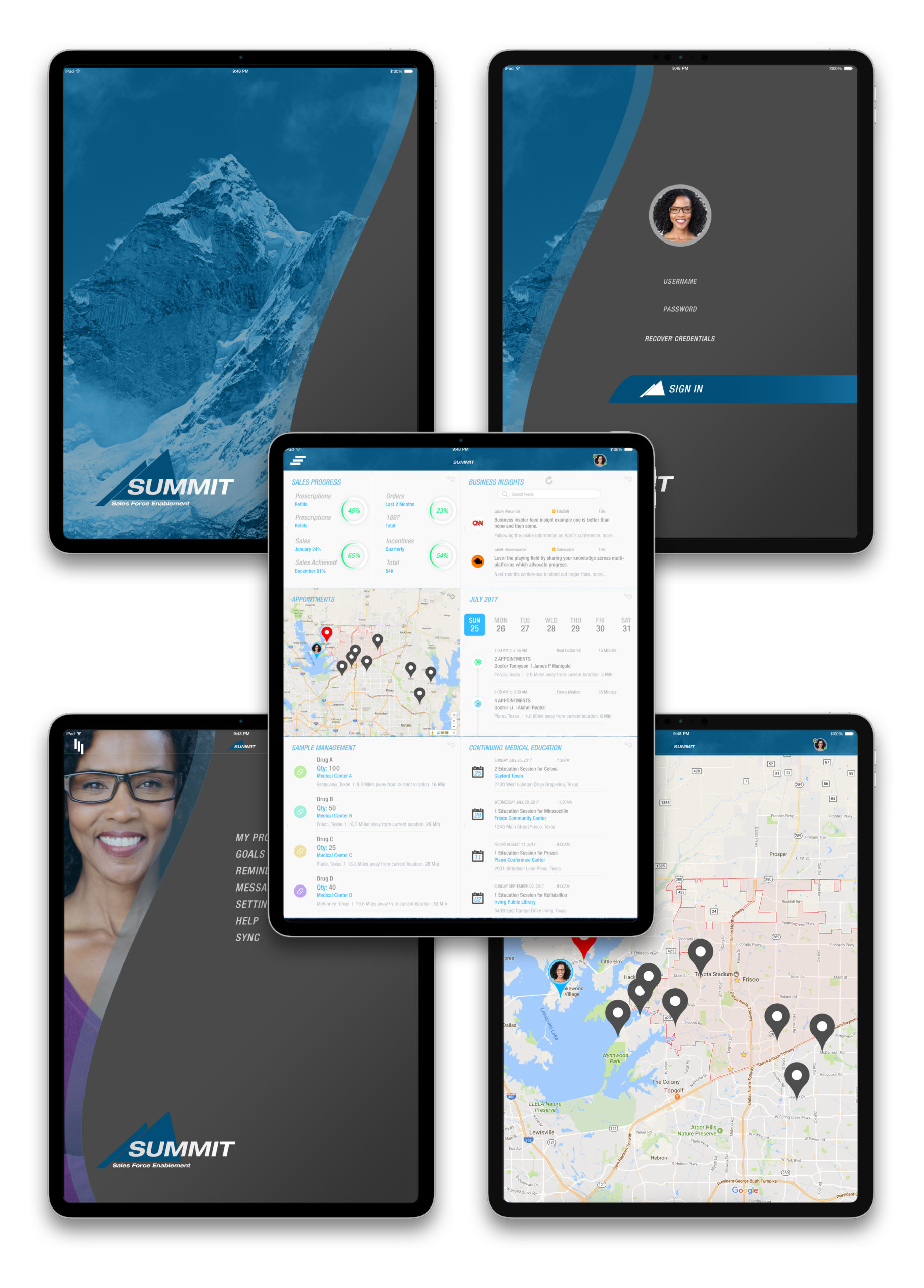
The Result:
Summit, the tablet application connecting doctors and Pharma.
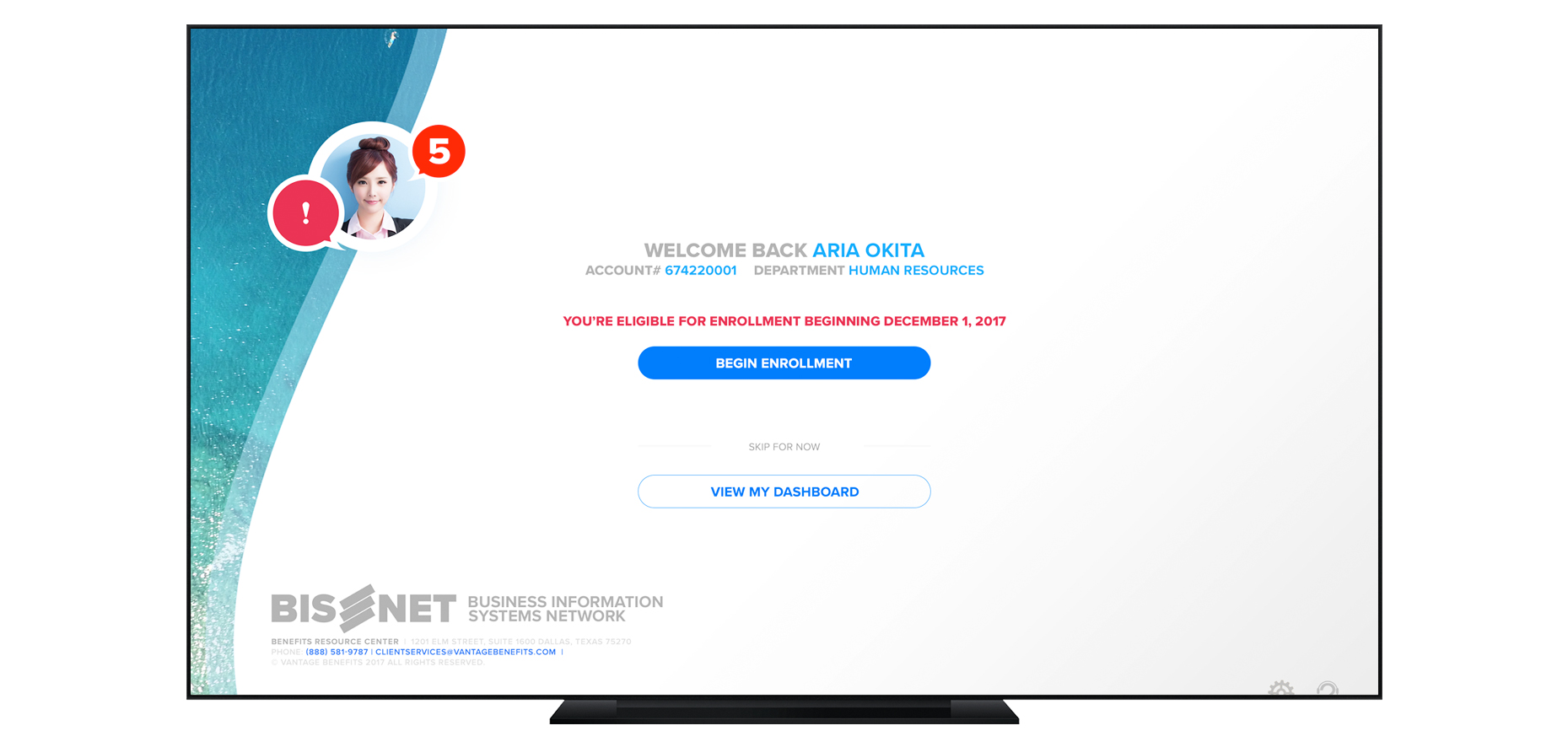
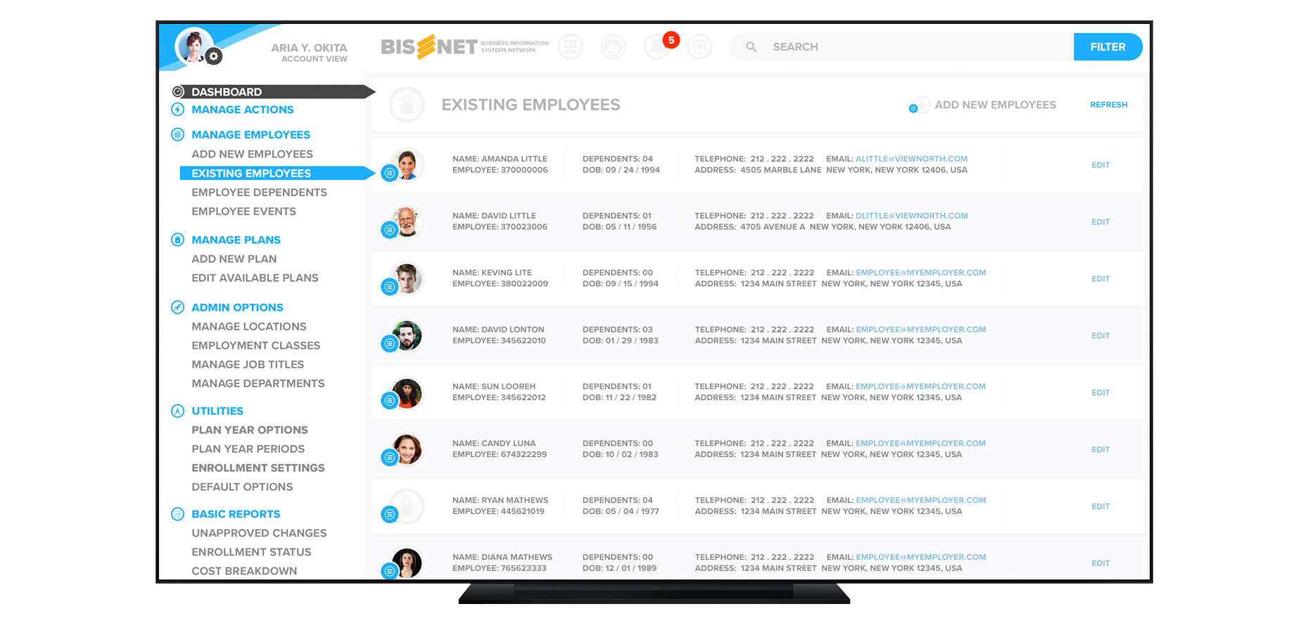
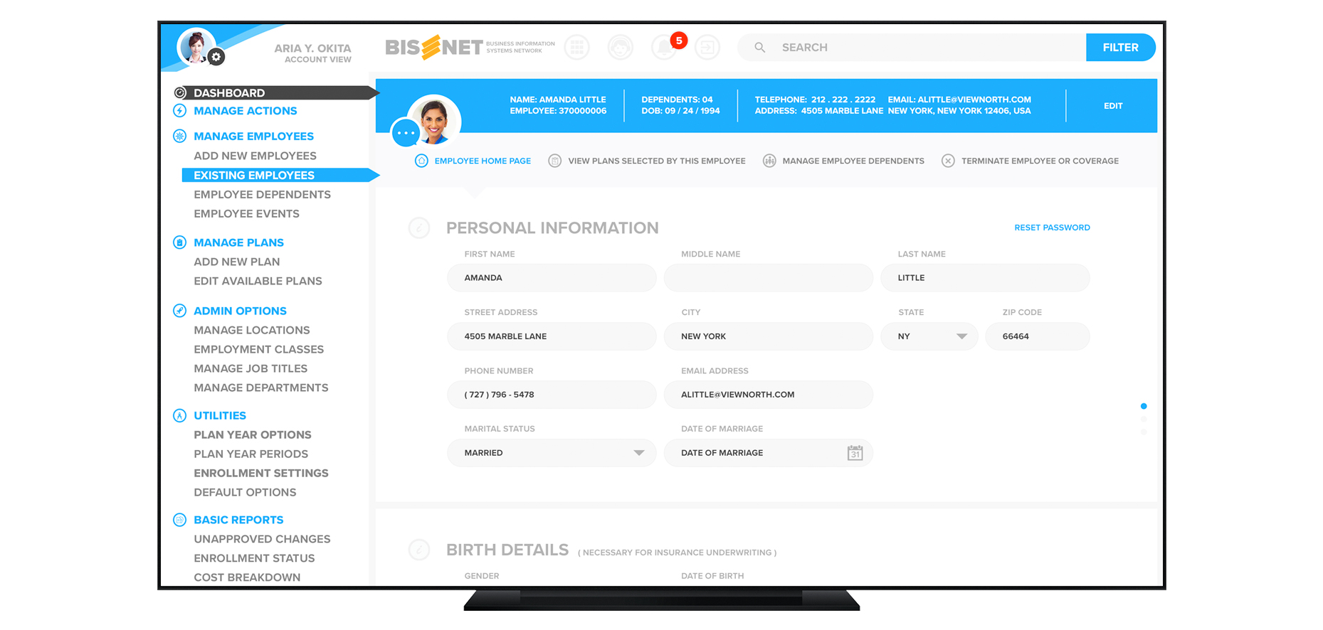
Bisnet Custom Salesforce UI
This particular project was to bring an outdated application for employee benefit enrollment and employer’s employee management database to the modern world. The initial phases began with a revamping of the logo and adding some identity to the brand. The application had to be web based, scalable across multiple platforms, and it had to cover multiple user roles. Primary platform would be desktops and tablets.
UX Research & Discovery | UX Design | UX Production Tools: Adobe Photoshop, Principle, Invision
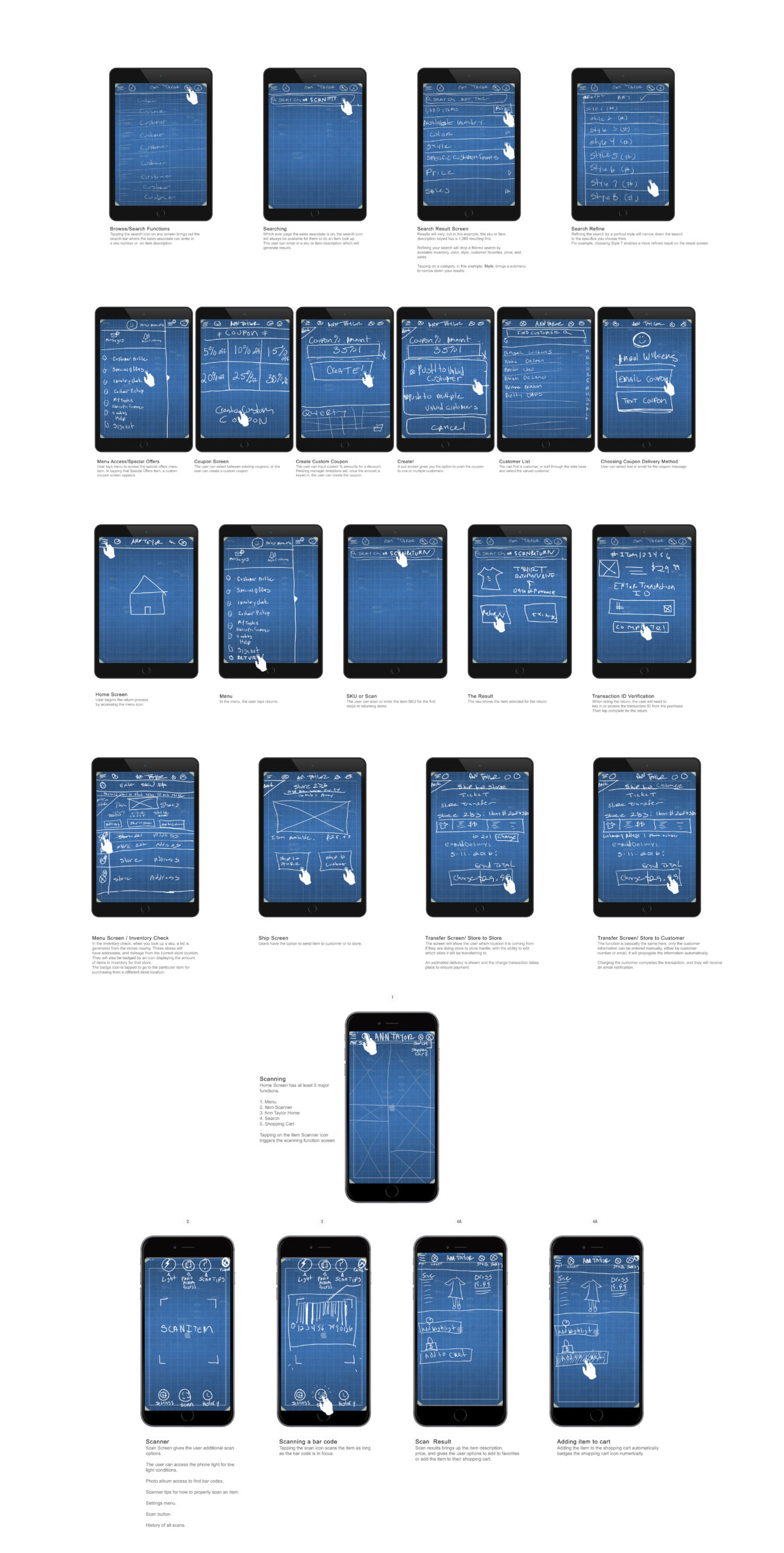
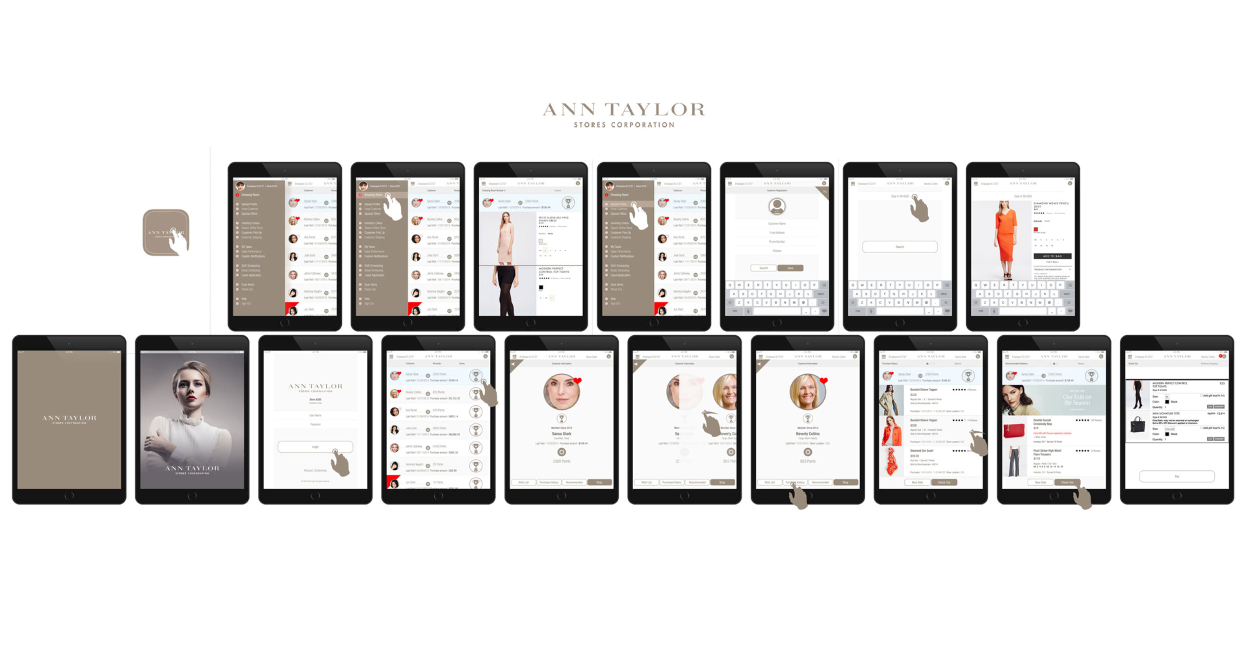
Ann Taylor has been a leading brand in the retail industry. This was an exciting project to lead and create the art direction for. The objective was to establish customer relationships with Ann Taylor store personnel in order to better serve the customer needs, improve sales, offer coupons, incentives, and market to the audience.
Outcome:
The iOS application would be a useful tool for the store team to generate more sales, understand the customer tastes in their product line, build customer loyalty, track rewards, and encourage customer communications.
The consumer side had an online store built into the application where the customer could order their product as well as communicate directly with their favorite store’s sales team. The companion Apple Watch application also worked to alert a consumer utilizing geo fencing, and purchase order notifications. This was built for iPads, iPhones, and the Apple Watch.
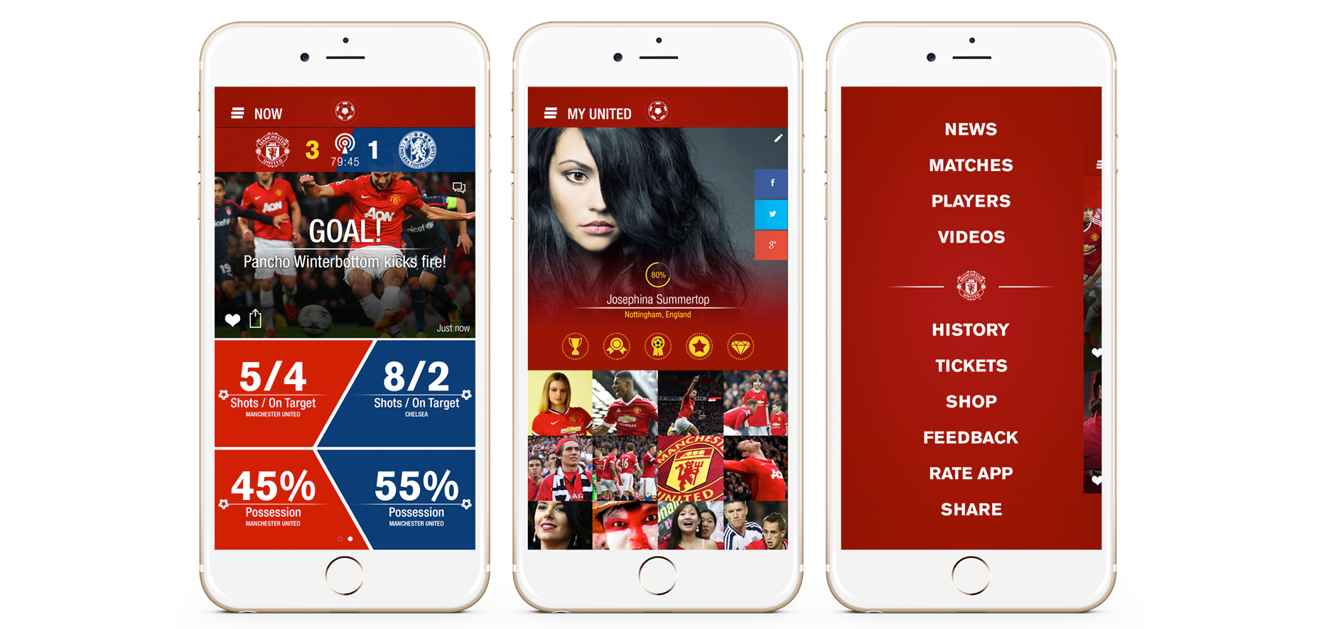
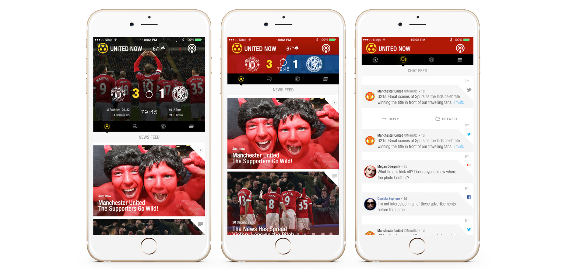
A subscription based application with perks that allow fans to be a part of the Manchester United team. The application was built for smart phones and loaded with an online store, live game feeds, interactive voting system, cross social media platform communication board, news feeds, videos, photo slideshows, and networking were all loaded into a smart phone app.
UX Research & Discovery | UX Design | UX Production Tools: Adobe Photoshop, Invision
Traveling art galleries often require large campaigns to promote a particular artist. This web app allowed for artists to showcase any prints they had for sale, and promote any shows they would be attending.
UX Research & Discovery | UX Design | UX Production Tools: Adobe Photoshop
Day in the Dark AR
A day in the dark was a project involving a viral campaign for a series of fantasy books. In this website the user would try and find clues that would unlock books in the UI. Each book provided additional clues where you would be able to find a key within the site that allowed the user to interact with a talking owl.
UX Research & Discovery | UX Design | UX Production Tools: Adobe Photoshop | Drawing | Photography
Trojan Condoms
Trojan condoms launched a campaign to promote their products and also to educate their customers about the dangers of STDs. Trojan wanted a web campaign that would allow registered users to request free samples of the Trojan brand condom line. The site had educational video content, a relevant news feed, and an online store to market their products.
UX Research & Discovery | UX Design | UX Production Tools: Adobe Photoshop, Invision
Beyondigital by HCL studio agency offered a lot of opportunity for a revamp of their website. It was a great project to work on because the team had so many great ideas and an excellent body of work. My rendition of the website plus the new branding concepts created for marketing purposes.
UX Design | UX Production Tools: Adobe Photoshop, Invision
Journey 2 Fitness
The Journey II Fitness project is a website created to bring in clients who are interested in personal fitness, nutrition, and healthy lifestyle videos. The integration of YouTube videos, menu plans, and booking of Coach Corn was created as a simple call to action purposed website.
UX Design | UX Production Tools: Adobe Photoshop, Sketch
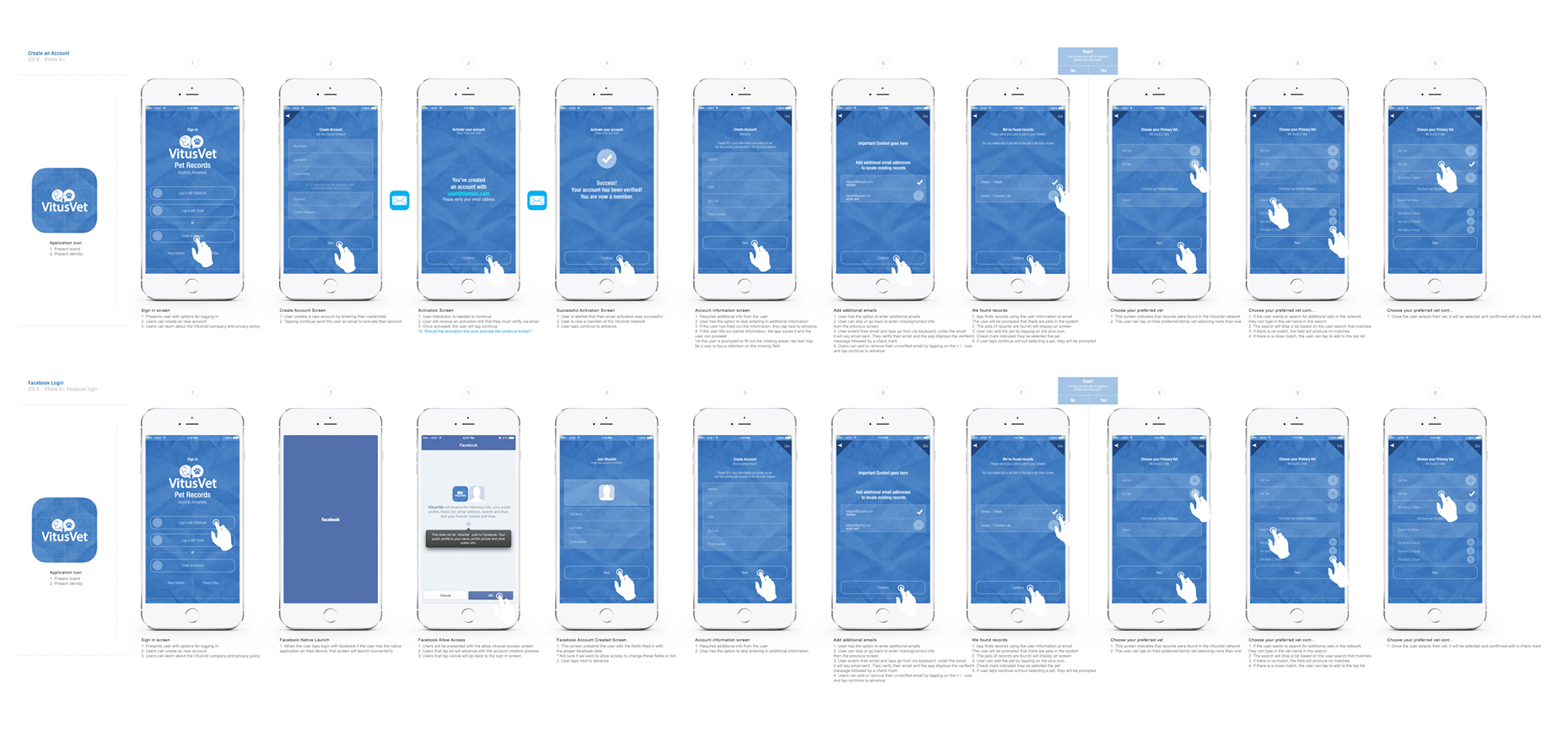
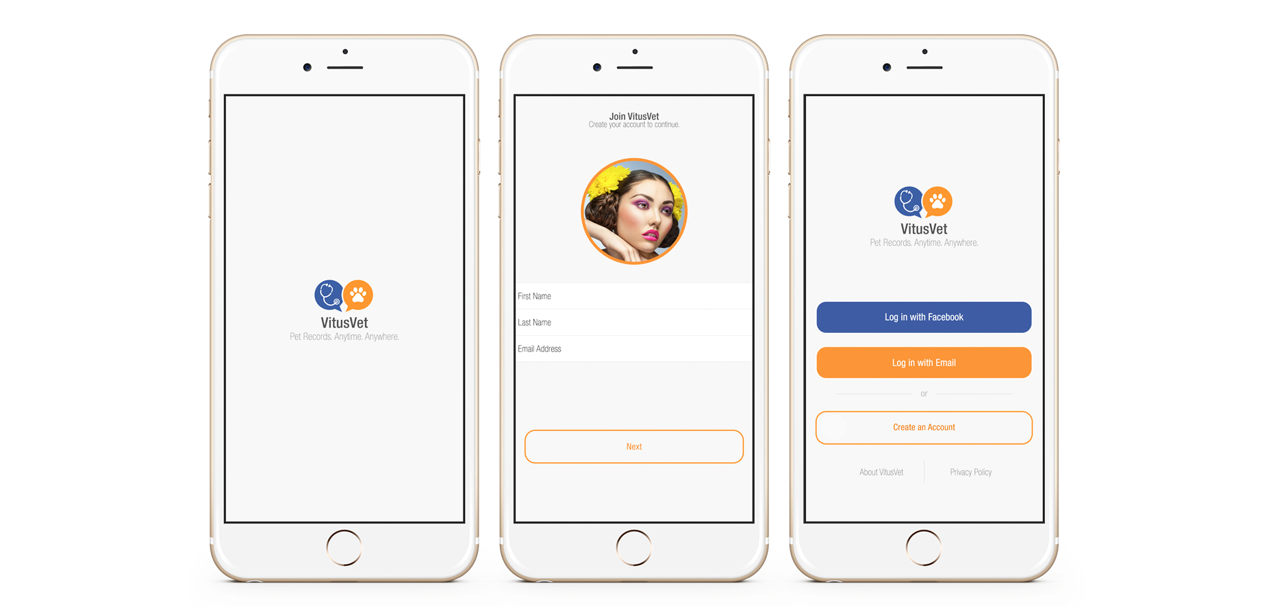
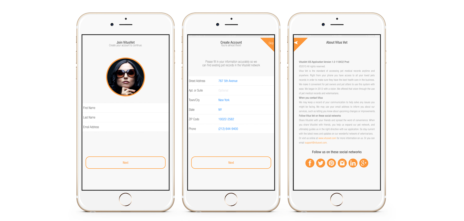
VitusVet Pet Medical Records
The convenient way to network Veterinarians across the world by giving them the ability to access a user’s pet medical records through the application. This multipurpose app also scheduled vet appointments, notifications on medications, and pet sitting instructions.
UX Design | UX Production Tools: Adobe Photoshop, Invision
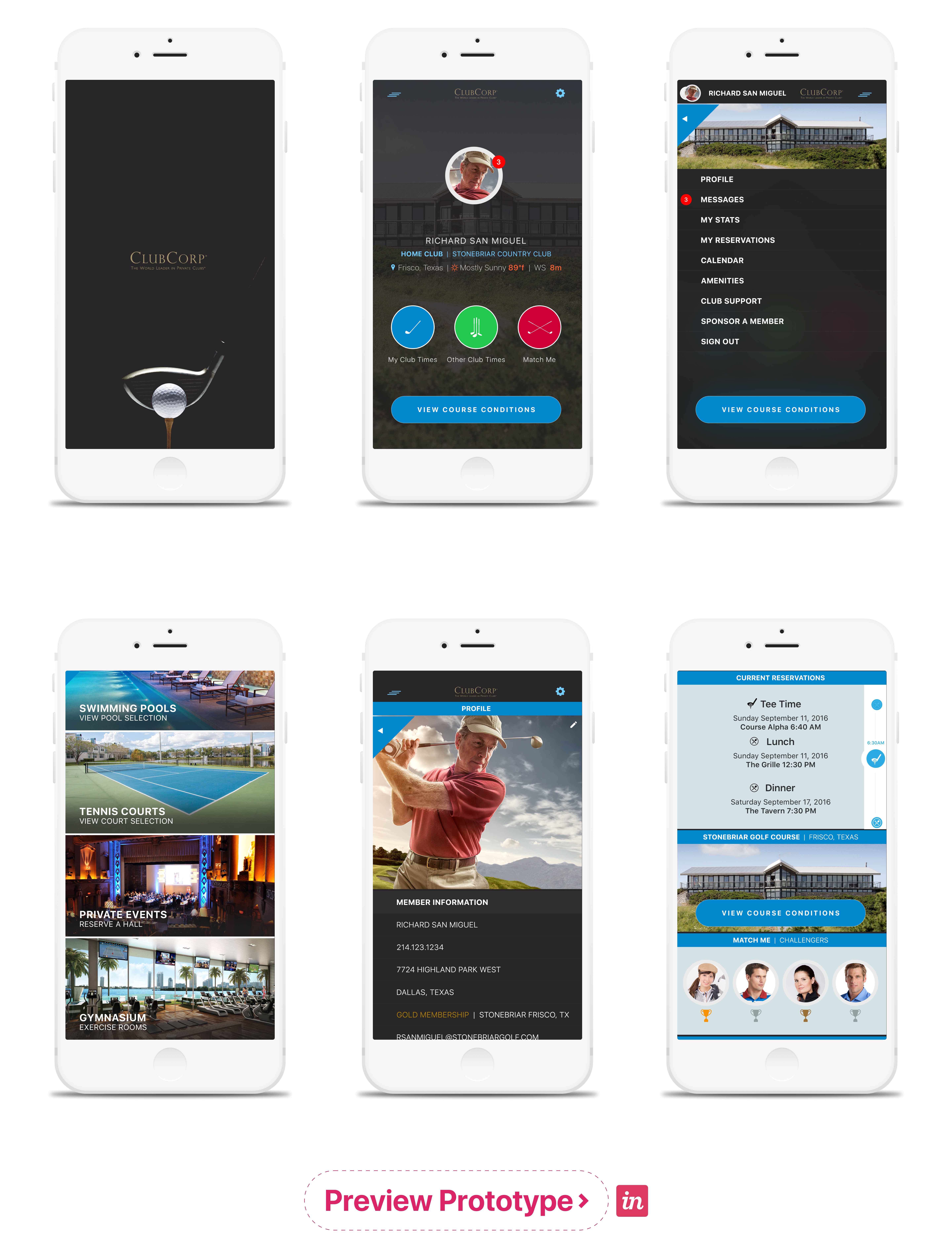
This Club Corp app was built for the purposes of creating a major convenience for members. It allowed members to be paired with other members with similar interest through their golfer’s section of the application. Daily course conditions could be updated to the application along with aerial videos for a live view.
Family members could easily access the club without the primary account holder having to be onsite. User’s could see how crowded the pool was before a visit. Booking major events could be scheduled through the application. A complete user experience was created for every interest the club had to offer its members.
UX Research & Discovery | UX Design | UX Production Tools: Adobe Photoshop, Principle, Invision
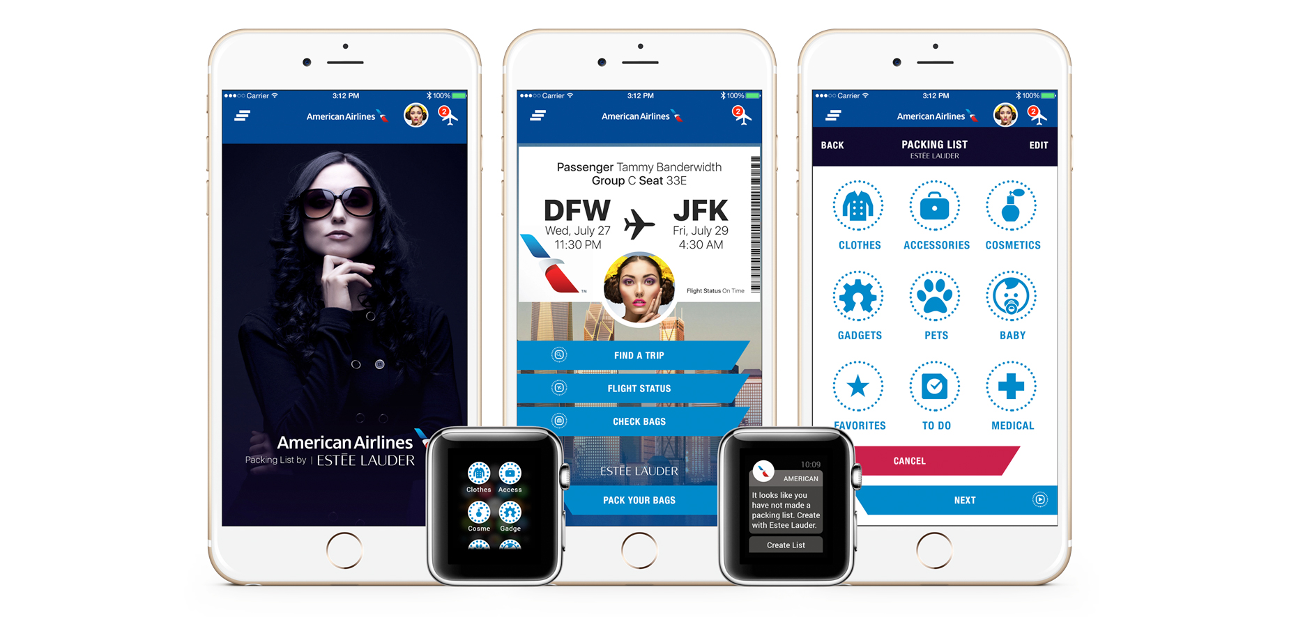
American Airlines Checklist & Kiosks
This simple application was a combined effort for American Airlines and Estee Lauder. The primary target audience was traveling female professionals who would have access to a checklist once they booked a flight through the airline.
This checklist provided the travel size makeup essentials which could be purchased through the app and picked up at an airport kiosk.
UX Research & Discovery | UX Design | UX Production Tools: Adobe Photoshop, Principle, Invision
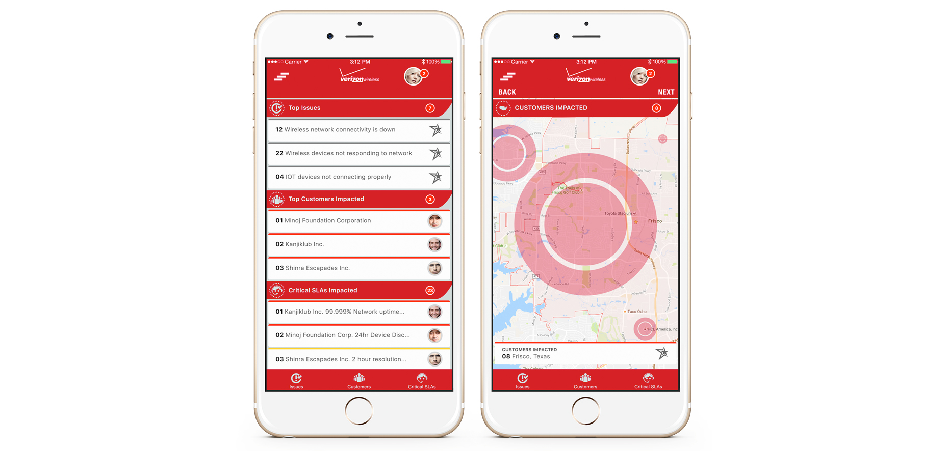
Similar to the Schlumberger app, this iOS application was a proof of concept for Verizon to measure field tech progress. A field tech would receive work orders and destinations for their shift, there they would record their progress and move onto the next order on their list.
UX Research & Discovery | UX Design | UX Production Tools: Adobe Photoshop, Principle, Invision
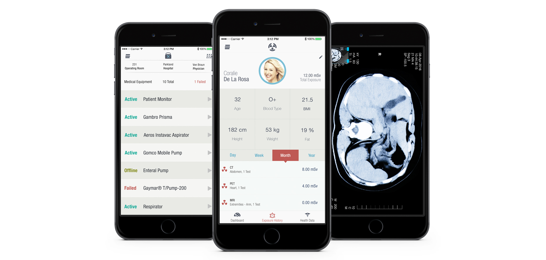
GE Healthcare is on the rise for modern application design ideas. This concept was created to showcase how the world operates in a mobile first ideology. Physicians can now access a patient’s data all in the palm of their hand. Preventative health care is a major market being explored by health industries in order to bring the patient and physician relationship together for effective results.
UX Research & Discovery | UX Design | UX Production Tools: Adobe Photoshop, Adobe XD, Sketch, Principle, Invision
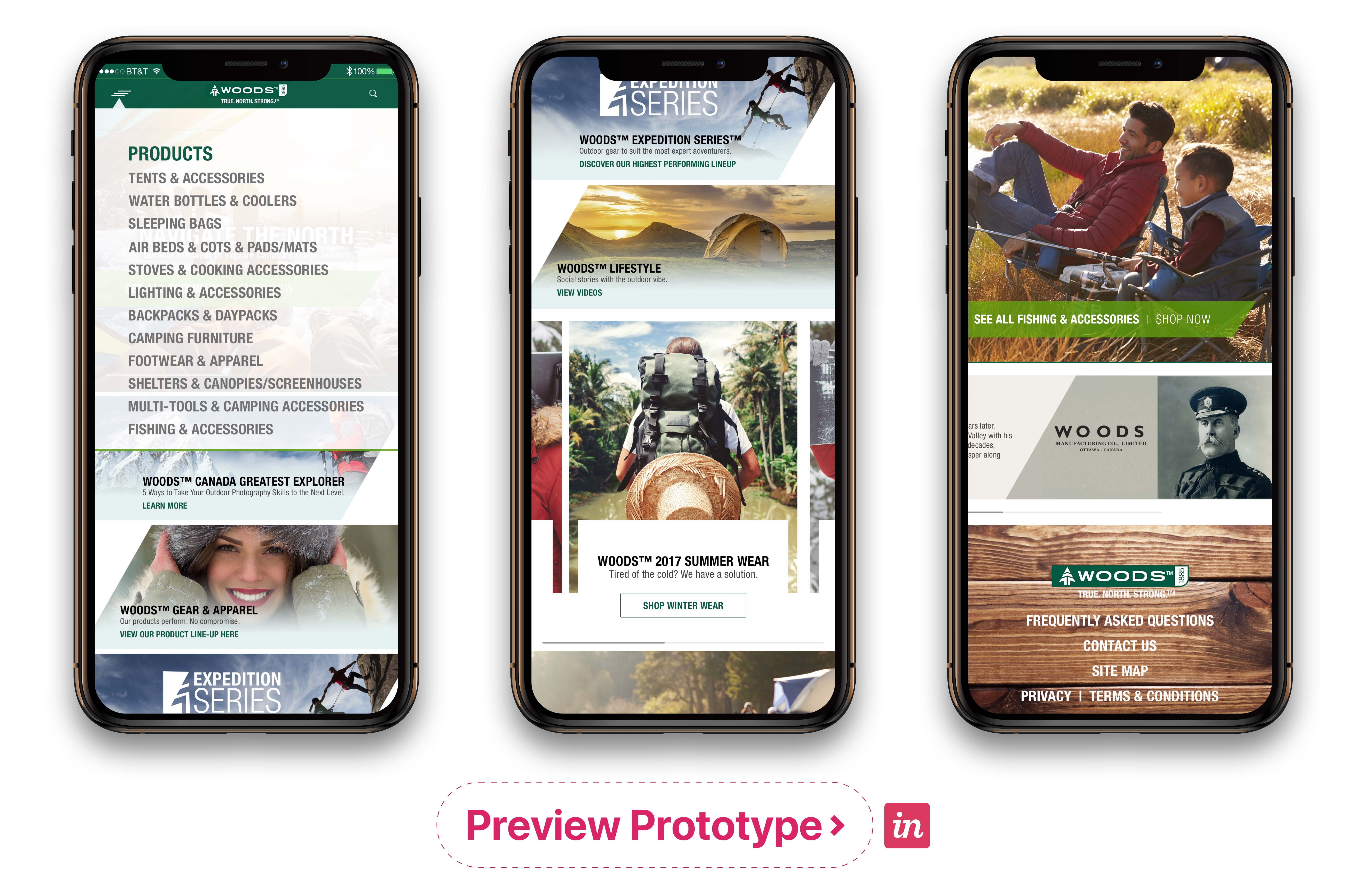
Woods Canada Retail & ECommerce
Ecommerce giant Woods Canada offers lots of products on their website. A focus on the mobile experience is key for a successful user flow.
UX Research & Discovery | UX Design | UX Production Tools: Adobe Photoshop, Adobe XD, Invision
Tesla Motors Model 3 Dash Display
Objective:
Proof of concept profile preferences for Tesla Dashboard display. Improved customization of a profile driver experience. The project was to begin showcasing how each driver can have custom preferences on the display to be driver ready when hitting the road. From a welcoming screen for card key/smart phone recognition and automated playlist.
Outcome:
Having to build the entire Tesla UI design system from scratch; three simple screens were created within a day to present to Tesla executives. The plan was to present screens that were within the Tesla model 3 standards while introducing simple additions to the current UI.
Services:
UX Research & Discovery | UX Design | Design Language |
Tools: Sketch, Adobe Photoshop, Invision
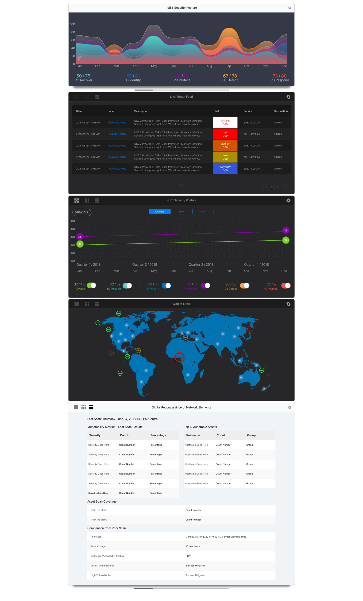
Zyston: Cyber Security
Objective:
Creating a visually rich cyber security system and widgets where companies can monitor their network vulnerabilities.
Outcome:
Current Progress.
Services:
UX Research & Discovery | UX Design | Design Language | Branding | UX Production